
Imagine this: your customer comes to you with a special bookbinding project. There is only one copy, it’s 800 pages long, it’s entirely hand illustrated and hand written on hand-made paper. Your binding method must be very sturdy in order to withstand repeated heavy handling. It must be artistically pleasing to some of the most famous and demanding artists in the world. And oh yes, it took the author untold years to complete to his perfectionist satisfaction.
 The year is 1692 and since human nature doesn’t change much, my guess is this prospective bindery customer wanted the job done by tomorrow, and he wanted a good price. While the scenario I’m describing is imaginary, the book itself is very real and quite a work to behold.
Erik Kwakkel is a medieval book historian at Leiden University. In his research he encountered a fascinating Dutch book archived in a French library database. The title, loosely translated, is Treatise on the use of Color in Watercolor Painting.
The handwritten and illustrated book from 1692 is nearly 800 pages long. Its author, A. Boogert, says in his introduction that he wrote the book to explain how to make watercolor paints. He also explains how to change color tones by adding various portions of water.
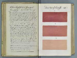
 The incredible thing is that he illustrates each color and every shade on the page opposite his written formula. (photo above left) As if that weren’t enough, he included an illustrated index of every color described in the book. Every color swatch and every illustration throughout the book is done by hand.
Boogert also says in his introduction that the book was intended for educational purposes during a time known as the Golden Age of Dutch Painting. As far as is known, the book is one of a kind, probably due to the technical printing obstacles involved in mass producing such a precisely illustrated book.
Perhaps students traveled TO the book to study color with an instructor with the book as a guide. Not much is currently known although Kwakkel says there is a Dutch student doing a PhD thesis on the book.
Of course the first thing I thought of, and probably what any printer will think of when seeing this, is the Pantone Formula Guide, which didn’t publish until 1963. The fact that it took nearly 300 years for technology to be able to handle such a printing job gives us an appreciation of the difficulties involved with the original book!
The technical obstacles to printing such a book in the 1600’s were huge. At the time it was certainly feasible to print a few hundred copies of a book consisting mostly of type with some woodcut illustrations to dress it up.
I'm not sure how they would have printed a book with hundreds of very precise color gradations. Although the inventions of movable type printing and the use of oil-based ink are credited to Gutenberg around 1439, printing technology didn't vary much from screw-type presses until the 1800's.
That's when the cylinder press and the rotary press were invented. The cylinder press (paper passes between a cylinder and a flat surface) produced up to 4,000 impression per hour and the rotary press (paper passes between two cylinders) produced up to 8,000 impressions an hour.
Until the advent of 4-color process work, it would have been difficult, if not impossible, to make an oil-based ink print to look like a watercolor. The reality for that period of history is that the only method to produce such a book correctly and accurately was to do it by hand.
Maybe I’m just nostalgic, but there’s something to be said for an appreciation of craftsmanship like this. Imagine having to do this project yourself! Every component of this book involved great attention to detail.
- Paper making
- The general outline and layout
- Precise mixing of water colors
- Categorizing and cataloging the color spectrum
- Carefully handwritten copy
- Binding technique and materials (it’s still in good shape over 300 years later)
Usually when we hear the word “craftsmanship” we think of a skilled person practicing a trade or craft. According to many dictionaries, it also implies that a product is produced with artistry, beauty or excellence. Here at the home of the Tri-Creaser we always say, “Why bother to print it if you can’t finish it.” It’s practically our motto. Every piece should look great from start to finish and in the end, accomplish what it was designed to do.
Printing and print finishing has a long, colorful history. This unique book reminds me that we should continue to strive for artistry, beauty and excellence in our work, even though we live in a fast-paced digital world.
Somehow the one-of-a-kind book survived and is housed in Aix-en-Provence, France at the Bibliothèque Méjanes. You can actually view images of the entire book here, courtesy of the library.
Share this story with the buttons above or at left. Or leave a comment below. Have a unique bindery job you worked on? Tell your story below!